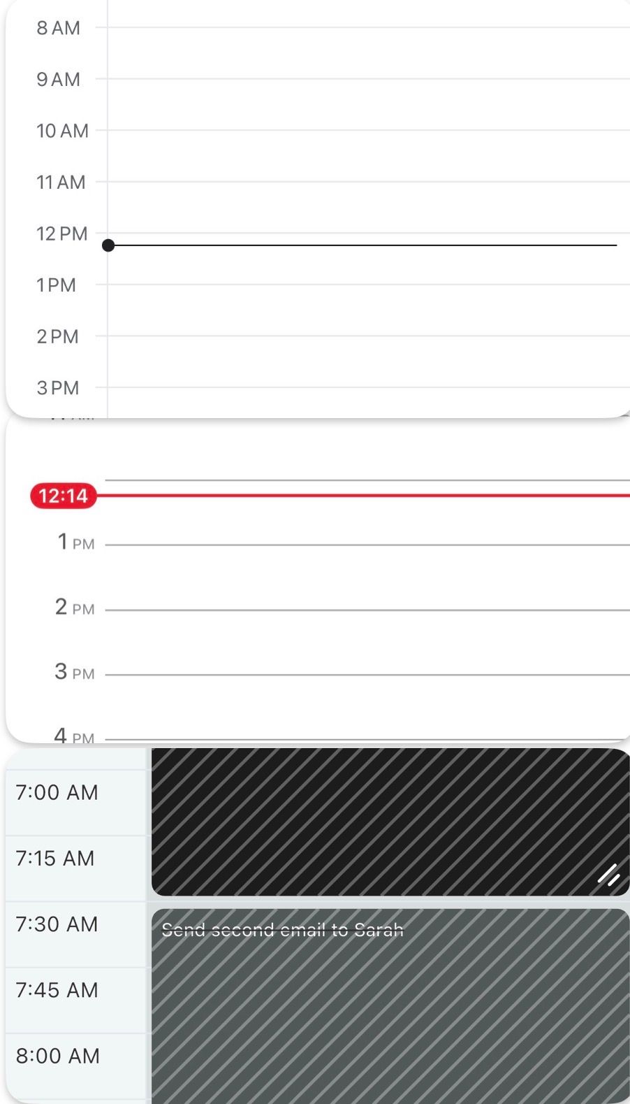
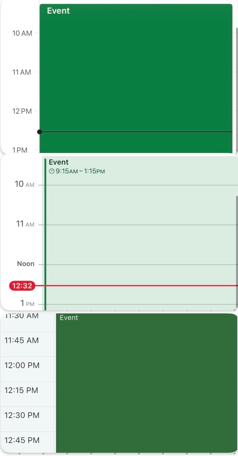
Condense the time column
Randomly noticed that visually the time column seemed to take up more space than perhaps necessary, which makes the event blocks seem like they have less space and are slightly more crowded than they could be otherwise.
I went to Google Calendar and Apple Calendar and confirmed that their time column is more condensed/tighter as well. This is of course a super small change, but just something that crossed my mind that might be worth considering as a small polish, if it’s easy to implement.
Here is a comparison of the three calendars, for context.
Please authenticate to join the conversation.
In Review
💡 Feature Request
5 months ago

James
Subscribe to post
Get notified by email when there are changes.
In Review
💡 Feature Request
5 months ago
James
Subscribe to post
Get notified by email when there are changes.