Option for Appointment Color to fill entire timeslot/row
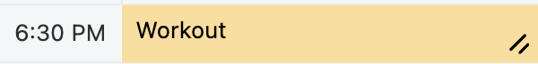
This request entails bringing back a visual design element from an earlier version of TimeFinder, in which the Appointment Color filled the entire row including the Time Label:
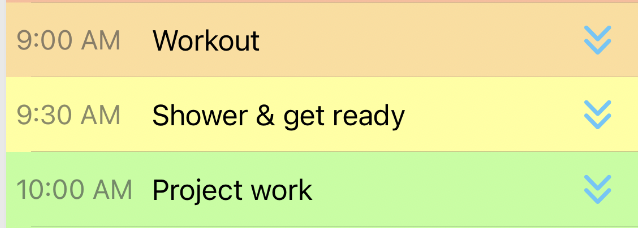
In contrast, in the current version of TimeFinder (which was rebuilt in 2024), this design was substituted with a more modular visual approach which allowed users to resize appointments by dragging on the corner, as seen here with rounded corners:

and without rounded corners (as configurable in Settings>Schedule>Customize Appearance):
It is possible to retain the new resize mechanic along with the old visual design, but it will take some work to make it happen. Please vote to express your interest in this 👍🏻
Please authenticate to join the conversation.
In Review
💡 Feature Request
Almost 2 years ago

Luke M
Subscribe to post
Get notified by email when there are changes.
In Review
💡 Feature Request
Almost 2 years ago
Luke M
Subscribe to post
Get notified by email when there are changes.