Preference for the old design
Hey, I know it’s just a personal preference but I liked the old design compared to the new one for several reasons:
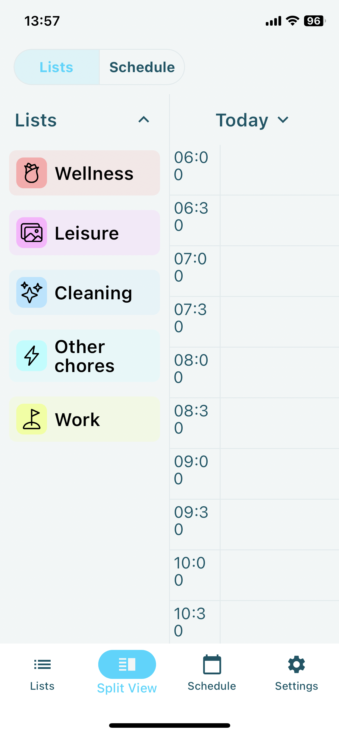
The new schedule looks like a table whereas the old one looked like an actual list (the time was colour-blocked together with the task).
The new colour blocks have rounded corners, which is distracting for me, I preferred the old rectangular side to side colour block (they filled out the whole screen) much more.
The moving line to indicate time is also distracting. To be honest it is also stressing me out, would love it if I had the option to remove it 🙏
The text for time and task description is placed on top left, whereas before it was vertically centred. Centre alignment is much less distracting for the eye.
Just like someone already said, before the schedule was much more condensed, one look and I could see what tasks are ahead. Now I have to constantly scroll up and down.
I preferred the old way of scheduling longer tasks as the repeats of that task instead of making the time block look really big, because now it’s much harder for me to at a glance estimate how long the task will take.
Currently for me when in Split view the time is cut off:
Basically, before I found the design to be much more simple, which is great for productivity tasks, because the simpler the layout, the less distracting it is and the more I can focus on actual tasks. Would love if I could choose to have the old design as an Appearance option 🙏❤
Thank you for your hard work! 🌼Really appreciate this app 🌼
Kamile
Please authenticate to join the conversation.
Completed
💡 Feature Request
About 2 years ago

Kamile Pudzemyte
Subscribe to post
Get notified by email when there are changes.
Completed
💡 Feature Request
About 2 years ago
Kamile Pudzemyte
Subscribe to post
Get notified by email when there are changes.