More Calendar Space: Replace Bottom Toolbar with Floating Shift Up/Down Controls
Hey Luke,
One UI change I’d love to suggest is reconsidering the large bottom toolbar in the Schedule view. It takes up a fairly significant amount of vertical space, which makes the calendar itself feel more compressed—especially compared with something like Google Calendar, where the schedule is able to use nearly the full height of the screen.
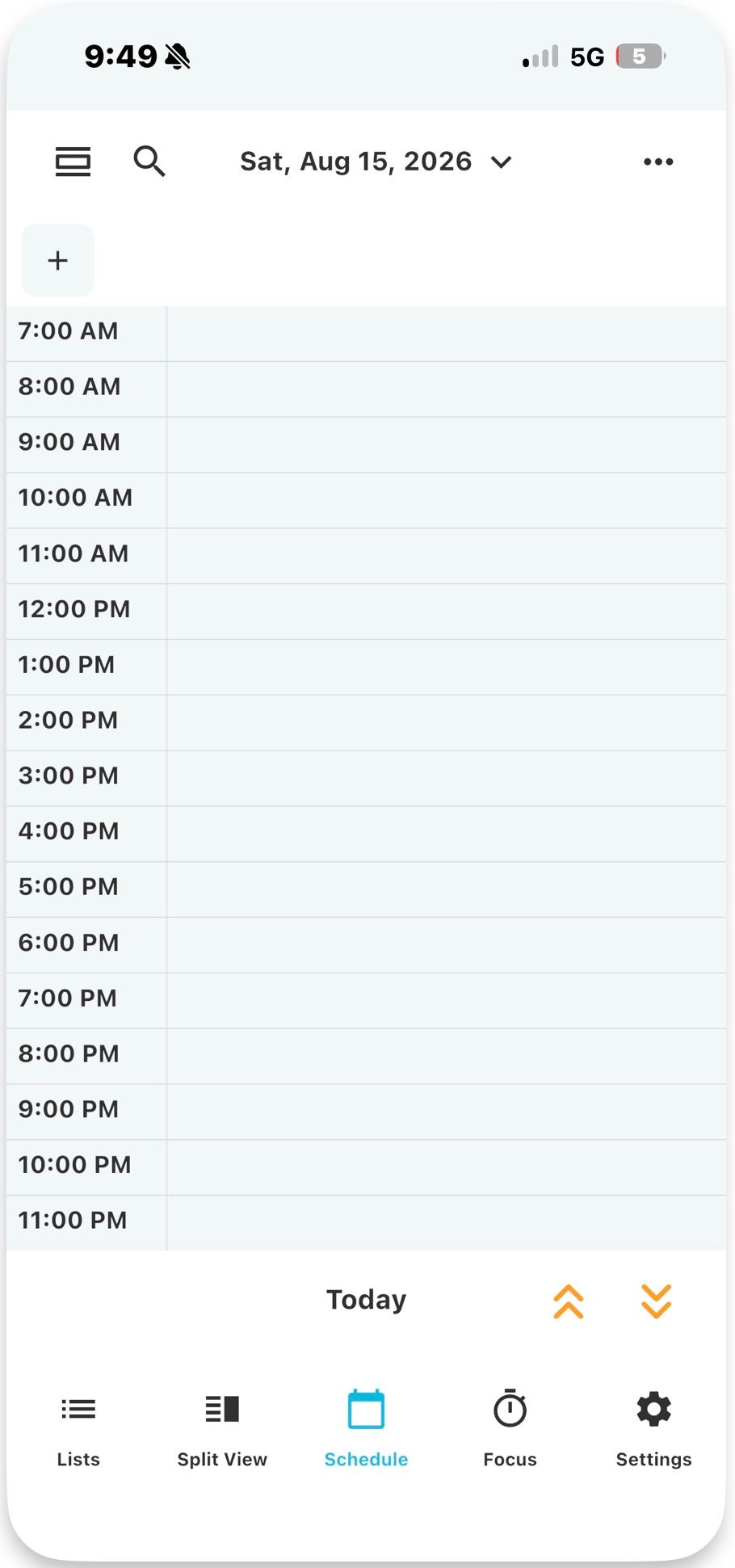
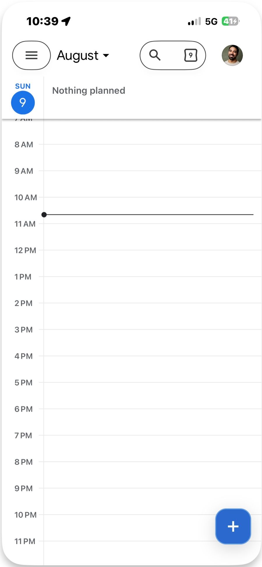
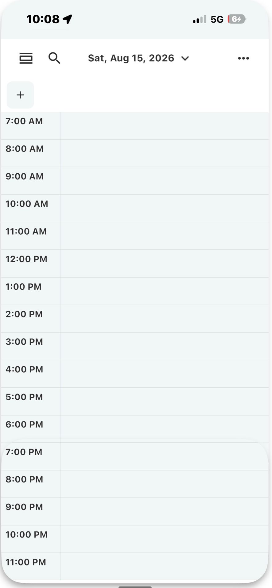
Given that the up/down shift ability is a distinctive TimeFinder feature, you may want to retain those controls. They could instead become a small floating button/pill, somewhat like the floating + button in Google Calendar. That would keep them immediately accessible while giving substantially more room to the calendar.
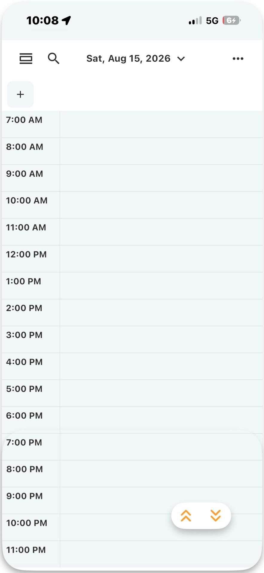
If there were another feature you particularly wanted to keep prominent (e.g., Focus or Split View), it could either be added to the floating button or moved to the top toolbar, where there is still some space. My favorite is probably the version with just the up/down arrows floating at the bottom and Focus remaining accessible from the top bar.
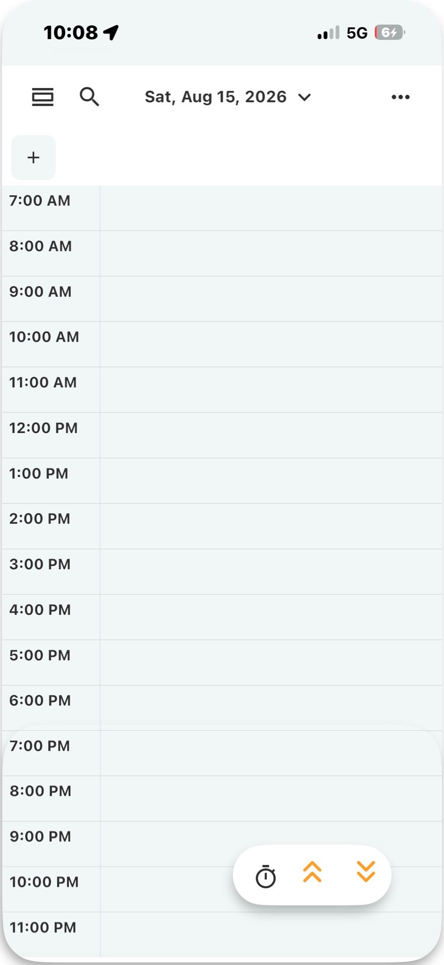
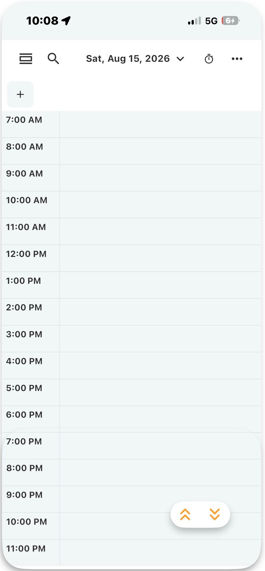
The other bottom-bar items—Lists, Split View, and Settings—seem like they could move into the three-dot menu without much loss in usability. That would make the Schedule view feel a lot cleaner and more spacious while still keeping the controls most relevant to manipulating the schedule immediately available.
Thank you.
Best,
James
Log in to comment and vote
Comments2
xela.codes
Aug 10
I personally use the “Today” button a lot so I think that should remain a dedicated button as well.
James
Aug 12
Hello,
Thanks for the input.
Came up with two options that could retain a today button.
This would be like Google Calendar, with a button on the top toolbar:
This would be like Apple calendar, with a button at the bottom:
Best,
James